Here’s a link to the final materials palettes on Pinterest: https://pin.it/iktj63hilbdjmo
Here's the exterior palette I started out with.
This is basically cedar with a typical transparent "natural cedar" type of stain, an almost-black charcoal grey that's still a bit warm, some dark brown (actually charred) wood, and glass. From this starting point I ended up simplifying things a bit, going with cedar siding, black aluminum trim, and grey stucco.
I was seeing these particular colours being used in quite a few new builds, both residential and commercial, and I was a bit concerned that this would be a "fad" that would fall out of style fairly quickly. But I actually have liked this particular colour combination for a really long time, and there are buildings that have been around for a long time that use similar materials, and they still look great to me. This is a nice looking scheme that has a timeless quality in my opinion. The grey stucco is a nod to concrete or stone, the wood siding gives it a nice natural feel, and the black trim gives it an architectural touch. I think a lot of people stay away from black because it's just so... black. A few years ago lots of people were using "commercial brown" for their windows and trim. I was never a big fan of it. I say if you want dark trim, go with straight black. It looks really sharp.
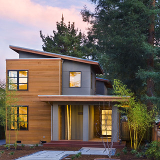
A useful tool for nailing down the materials palette was houzz.com - I saved a bunch of photos of houses I saw on there that had colours and materials that resonated with me. Here's one I used as a main reference.
I think this house is from 2013 or earlier, and somewhere on the California coastal area. The mix of modern & asian influences and west-coast vibe here were the perfect example of what I was going for. I think this cedar / grey stucco / black trim look has made its way from the west coast and can be found pretty much everywhere now. But this is a look that I know I can be happy with for a really long time.
Here's a link to my "ideabook" on Houzz for exterior materials. I think it can be viewed by anybody.
https://www.houzz.com/ideabooks/1417243/list/houzzerd-s-exterior
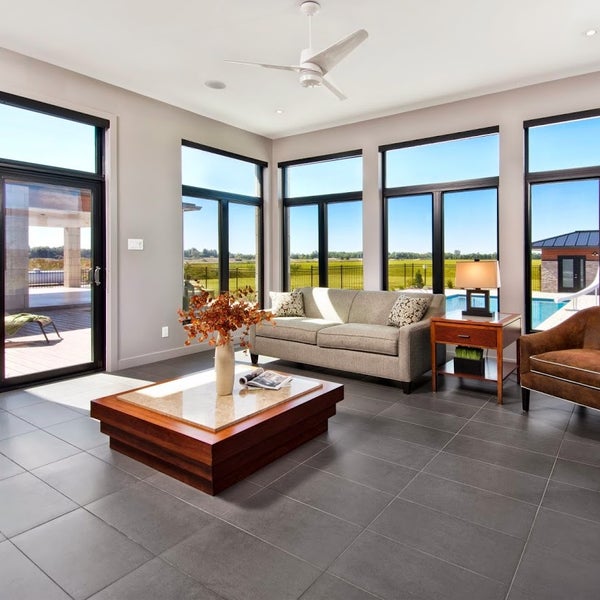
The interior color palette took a little longer to figure out but I knew that I wanted to contrast the darker shades of the exterior palette with a much lighter interior. Also, since our house is actually quite small by modern standards, I wanted lighter colours to make the space feel more open. We ended up going with an interior palette like this:
Basically it's white, light wood, charcoal, and grey (especially concrete). Since we completed our renovation I've started to see this particular combination more and more. It's gotten really popular. Again, when you pick a style and suddenly everyone seems to be doing it, you have to wonder if you just got swept up in a trend that will soon pass. But I really like this mix of materials, and have for a long time. This is white oak, a white paint called "Chantilly Lace" (which was one of the only material recommendations our architect gave us; the other was a light), a very dark but warm grey called "Iron Ore" (it's actually a very dark shade of greenish grey) and a concrete-look tile called Ragno Sound Smoke if I recall correctly. There are a couple of other touches, such as the natural slate tile we have in our entrance, but basically the whole interior of the house sticks to this same palette, and it works great because our house is very open concept without a lot of doors. The spaces flow together and the unified palette makes it feel more spacious. It's very zen-like.
You really don't have to look far to see lots of examples of this kind of colour scheme. Even the latest IKEA catalogue was featuring this kind of look. But the way I decided on this combination was by looking through a large stack of Japanese architecture books that I hauled with me back from Himeji on one of our trips there several years ago. Basically, light wood and white dominated nearly every single featured interior. There were one or two houses with darker wood, mostly larger places, but there was a really clear dedication to the natural beauty of wood (lots of it) against a clean, airy backdrop of white.
My interest in concrete probably also started there, in particular by looking at a design called "Dual House" by Kenichi Komura, which you can see here:
Even though this is an exterior view I really liked the monolithic concrete they used for all the hardscaping. This house has got to be one of my all time favourites. It must have been super expensive, because the whole thing is pretty incredible both inside and out, and located in one of the most expensive cities in the world too. Anyway it got me thinking about concrete. Then I saw pictures of a concrete backsplash in a kitchen, which I thought was pretty cool. We eventually found a local craftsman who does concrete backsplashes and were glad to have his work in our kitchen and main bathroom.
I got to like the idea of charcoal black accents as I started to consume more books, magazine and online posts about modern architecture. Black seems to lend an architectural quality to a house because, I think, architects draw with black ink. I've always like pen and ink sketches, especially architectural renderings. One of my favourite books as a teenager was "Rendering with Pen and Ink", which I still have. The black seems to give certain elements like window frames, trim, hardware, etc. a "drawn" quality that harkens back to something a draftsman would sketch. I think having black frames on the windows inside allows the outside views to really take centre stage, creating a crisp border between the white walls and the outdoor scenery. The charcoal black is actually that "Iron Ore" shade I mentioned earlier. When I first saw the windows installed in our house, I was actually a little disappointed because I was thought we were getting more of a neutral of bluish slate grey. Quite harshly modern. But I have to say the subtly warm tone of the Iron Ore has really grown on me. It's black, but with just a hint of warmth that works really well with the white oak floors and concrete tiles.
Here's a picture of a house with windows from the same manufacturer we used, and the same colour of window frames. I think this was the picture that when I saw it I was 100% convinced that black windows were the way I wanted to go.
Along with the window decisions we chose to not have the windows trimmed out in the traditional way. Instead we have drywall returns, so the drywall just wraps around to meet the window frames and there's no moulding around the windows at all. It definitely gives things a very clean and simple, modern look. I would have gotten rid of the baseboard trim too, if I could have, but it turns out that not having baseboards is a lot more expensive, if you want to do it right. So instead we have a simple, flat 3" baseboard without any contours or fluting.
There's a neat YouTube channel called the 30 x 40 Workshop where an architect named Eric Reinholdt talks about topics like window trim, materials, design and all sorts of architectural things. I got quite a few ideas from watching that as well, even though I think our renovation was mostly done by the time I got into watching it. Here's a link to his website with the videos:
All of the materials we ended up using are slightly "warmer" than what I originally thought I wanted. But now as I look back I think the stark neutral colours you often see in modern design would have been a little too harsh. The slightly warmer greys, blacks and wood tones have a very modern feel without being austere. They're very warm and welcoming.
People who've come to our place have commented that it feels so peaceful. It's a zen-like quality that pervades the whole house, and I'm pretty happy about that. It came about intentionally, but at the end of the day it's really just about sticking to a limited palette of lighter, natural materials. Against this backdrop we have a lot of possibilities for placing a few accents here and there which can really stand out and refine the space. One of those is the indoor garden, or "tsuboniwa" that I'll write about maybe in the next post.
I realize this is a long ramble about probably boring stuff, but I wanted to write this all down anyhow, even if it's just for myself to go back and reminisce about in a few years' time.


