Showing posts with label Design. Show all posts

Wednesday, October 16, 2019

Interior / Exterior Palettes

I've been wanting to get back to writing about our renovation to finish parts of the story and keep a records of some things I learned along the way. It will soon be 3 years since we finished the reno; the dust has settled and I've had time to reflect. Also, it gets dark earlier now, so instead of pottering around in the garden outside, I'm behind the computer in the office, listening to the rain.

One thing that was really helpful for our renovation was to have a good idea of the palette of colours, materials and textures that I wanted. Basically, anything you can decide that you want ahead of time is going to save you a lot of stress later on. Fortunately I knew what I wanted for interior / exterior colours and materials from early on. I shared this with our architect, too, and got a "looks great!" in response, so I figured we were on the right track. I guess the architect must have forgotten or just chose to ignore my preferences though because later on when we needed to make some final decisions they proposed something really different.

Here’s a link to the final materials palettes on Pinterest: https://pin.it/iktj63hilbdjmo

Here's the exterior palette I started out with.


This is basically cedar with a typical transparent "natural cedar" type of stain, an almost-black charcoal grey that's still a bit warm, some dark brown (actually charred) wood, and glass. From this starting point I ended up simplifying things a bit, going with cedar siding, black aluminum trim, and grey stucco.


The actual materials are Maibec "Algonquin Amber" siding, Adex stucco in a shade called W-206-5E and black aluminum on the window frames, fascia, soffits and flashing. We have quite a lot of large windows too which makes glass a fairly prominent material in the exterior palette as well.

I was seeing these particular colours being used in quite a few new builds, both residential and commercial, and I was a bit concerned that this would be a "fad" that would fall out of style fairly quickly. But I actually have liked this particular colour combination for a really long time, and there are buildings that have been around for a long time that use similar materials, and they still look great to me. This is a nice looking scheme that has a timeless quality in my opinion. The grey stucco is a nod to concrete or stone, the wood siding gives it a nice natural feel, and the black trim gives it an architectural touch. I think a lot of people stay away from black because it's just so... black.  A few years ago lots of people were using "commercial brown" for their windows and trim. I was never a big fan of it. I say if you want dark trim, go with straight black. It looks really sharp.

A useful tool for nailing down the materials palette was houzz.com - I saved a bunch of photos of houses I saw on there that had colours and materials that resonated with me. Here's one I used as a main reference.


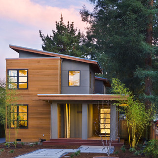
I think this house is from 2013 or earlier, and somewhere on the California coastal area. The mix of modern & asian influences and west-coast vibe here were the perfect example of what I was going for. I think this cedar / grey stucco / black trim look has made its way from the west coast and can be found pretty much everywhere now. But this is a look that I know I can be happy with for a really long time.

Here's a link to my "ideabook" on Houzz for exterior materials. I think it can be viewed by anybody.
https://www.houzz.com/ideabooks/1417243/list/houzzerd-s-exterior

The interior color palette took a little longer to figure out but I knew that I wanted to contrast the darker shades of the exterior palette with a much lighter interior.  Also, since our house is actually quite small by modern standards, I wanted lighter colours to make the space feel more open. We ended up going with an interior palette like this:

Basically it's white, light wood, charcoal, and grey (especially concrete). Since we completed our renovation I've started to see this particular combination more and more. It's gotten really popular. Again, when you pick a style and suddenly everyone seems to be doing it, you have to wonder if you just got swept up in a trend that will soon pass. But I really like this mix of materials, and have for a long time.  This is white oak, a white paint called "Chantilly Lace" (which was one of the only material recommendations our architect gave us; the other was a light), a very dark but warm grey called "Iron Ore" (it's actually a very dark shade of greenish grey) and a concrete-look tile called Ragno Sound Smoke if I recall correctly.  There are a couple of other touches, such as the natural slate tile we have in our entrance, but basically the whole interior of the house sticks to this same palette, and it works great because our house is very open concept without a lot of doors. The spaces flow together and the unified palette makes it feel more spacious. It's very zen-like.

You really don't have to look far to see lots of examples of this kind of colour scheme. Even the latest IKEA catalogue was featuring this kind of look. But the way I decided on this combination was by looking through a large stack of Japanese architecture books that I hauled with me back from Himeji on one of our trips there several years ago.  Basically, light wood and white dominated nearly every single featured interior. There were one or two houses with darker wood, mostly larger places, but  there was a really clear dedication to the natural beauty of wood (lots of it) against a clean, airy backdrop of white.  

My interest in concrete probably also started there, in particular by looking at a design called "Dual House" by Kenichi Komura, which you can see here:

Even though this is an exterior view I really liked the monolithic concrete they used for all the hardscaping. This house has got to be one of my all time favourites. It must have been super expensive, because the whole thing is pretty incredible both inside and out, and located in one of the most expensive cities in the world too. Anyway it got me thinking about concrete.  Then I saw pictures of a concrete backsplash in a kitchen, which I thought was pretty cool. We eventually found a local craftsman who does concrete backsplashes and were glad to have his work in our kitchen and main bathroom.

I got to like the idea of charcoal black accents as I started to consume more books, magazine and online posts about modern architecture. Black seems to lend an architectural quality to a house because, I think, architects draw with black ink.  I've always like pen and ink sketches, especially architectural renderings.  One of my favourite books as a teenager was "Rendering with Pen and Ink", which I still have. The black seems to give certain elements like window frames, trim, hardware, etc. a "drawn" quality that harkens back to something a draftsman would sketch. I think having black frames on the windows inside allows the outside views to really take centre stage, creating a crisp border between the white walls and the outdoor scenery. The charcoal black is actually that "Iron Ore" shade I mentioned earlier. When I first saw the windows installed in our house, I was actually a little disappointed because I was thought we were getting more of a neutral of bluish slate grey. Quite harshly modern. But I have to say the subtly warm tone of the Iron Ore has really grown on me.  It's black, but with just a hint of warmth that works really well with the white oak floors and concrete tiles.

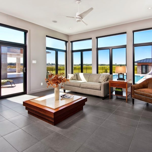
Here's a picture of a house with windows from the same manufacturer we used, and the same colour of window frames. I think this was the picture that when I saw it I was 100% convinced that black windows were the way I wanted to go.


Along with the window decisions we chose to not have the windows trimmed out in the traditional way. Instead we have drywall returns, so the drywall just wraps around to meet the window frames and there's no moulding around the windows at all. It definitely gives things a very clean and simple, modern look. I would have gotten rid of the baseboard trim too, if I could have, but it turns out that not having baseboards is a lot more expensive, if you want to do it right. So instead we have a simple, flat 3" baseboard without any contours or fluting.

There's a neat YouTube channel called the 30 x 40 Workshop where an architect named Eric Reinholdt talks about topics like window trim, materials, design and all sorts of architectural things. I got quite a few ideas from watching that as well, even though I think our renovation was mostly done by the time I got into watching it. Here's a link to his website with the videos:


All of the materials we ended up using are slightly "warmer" than what I originally thought I wanted. But now as I look back I think the stark neutral colours you often see in modern design would have been a little too harsh.  The slightly warmer greys, blacks and wood tones have a very modern feel without being austere. They're very warm and welcoming. 

People who've come to our place have commented that it feels so peaceful. It's a zen-like quality that pervades the whole house, and I'm pretty happy about that. It came about intentionally, but at the end of the day it's really just about sticking to a limited palette of lighter, natural materials. Against this backdrop we have a lot of possibilities for placing a few accents here and there which can really stand out and refine the space.  One of those is the indoor garden, or "tsuboniwa" that I'll write about maybe in the next post.

I realize this is a long ramble about probably boring stuff, but I wanted to write this all down anyhow, even if it's just for myself to go back and reminisce about in a few years' time.


Wednesday, October 11, 2017

The Top of the Slope

After a year-long hiatus I've been wanting to get back to this blog because a lot has happened in the meantime, and a lot of interesting stuff that did happen throughout our project hasn't been written about yet.

I recently watched a Youtube video where some people started a renovation and the host of the program remarked that they were on a "slippery slope".  I think this is the way a lot of renovations seem to go; you end up dealing with a lot more than you bargained for in terms of time, money and stress. It also seems like a common thread that people get the idea that they want to do a renovation and they start out being very ambitious and really stretching themselves to the breaking point.  Everybody has their own story for how they got onto the slippery slope, I guess.  For me it was this Dwell magazine from February 2010.


Yep, way back in 2010 is when the seed of what would become this crazy renovation saga was planted.  This magazine cover really jumped out at me, and believe it or not I think the reason is because of that green car on the cover, which I've since learned is a '63 Thunderbird.  I'm not a car enthusiast, at all, but for some reason that car really grabbed my attention and I think it's because when I was very, very little, I had a tiny green matchbox car that looked like that green mist '63 T-bird. It turns out the house in the picture is in Michigan, where my grandparents were originally from, and which I visited once as a very small child, and it has a kind of eastern US mid-century modern vibe that must have triggered the neural remnants of some deeply buried childhood impressions. Plus it's a damn cool house.

 So my girlfriend at the time, who is my wife now, said "Why don't you get it if you like it?". So I did.  And flipping through the pages I began this journey into all things housey and designery and architecty.

Truth is before I became an engineer, I always wanted to be an architect.  I like drawing, and I drew a lot of buildings as a kid. I also bought the house I was living in with the idea that one day I would renovate it, and add a second storey on it, like many of the houses in our neighborhood have done over the years.  So the idea to renovate was already there but this magazine kind of kick-started my interest in it for real.  One of the ads in this magazine was for the Turkel Dwell Homes Collection which is manufactured by Lindal Cedar Homes. One of the pictures really stood out as a nice design for a narrow city lot.


I thought this house was really cool. Turkel is a west-coast firm from California so it probably resonated with my west-coast roots.  I got a little obsessed about finding out all the details of this plan and managed to track down some layouts for this and other Turkel-designed Lindal homes.  I found the efficiency of the designs incredibly interesting. Architecture is such a cool blend of practical and efficient use of space, mixed with artistic concessions, kind of like a tension-release interplay between hard-cold science and creative, emotional art.

Around this time I stumbled across some pictures by Toronto firm SuperKul who did this amazing house there called the Crescent Road House.


This also kind of resonated because the lot size is and layout is pretty similar to ours. The house isn't much wider than ours, and although this was obviously a really high-end build (it has an elevator inside) I thought this could be a pretty good source of inspiration. I contacted Superkul to see if they could do a project where we live, but then I started thinking it would be hard to work on a custom design with somebody so far away. I like this house enough that I tried building a 3D model of the layout.


It turns out that this house, as well as the Dwell-Turkel-Lindal house were both too big for us to be able to build, because I found out there are restrictions on how big of a house you can build on the lots in my neighborhood, since they are close to the 100-year flood plain. So I started messing around in Sketchup.  Just tonight, I stumbled across a few of the old Sketchup models that I started making back then to try and come up with ideas for a second-story addition and extension on our house.  Here are a couple of them.


I know these are not very good, but they were kind of fun and more importantly, I started to realize that unless you are building something pretty standard, it's hard to come up with a good design where all the details fall into place. Take the carport for example. Way too high for one thing, owing to the fact that our house was originally constructed as a "storey and a half" bungalow with the basement half sticking up out of the ground.

After messing around with Sketchup I realized that even though it was fun it was not really a good way to approach designing a floor plan. This is what architects call "the program" I guess. You have to start by figuring out what rooms go where.  You do that before going all crazy in Sketchup.  So I found an website called Floorplanner, which was really cool.  You can design your floor plan and even put little pieces of furniture in it, and then click a button to see what it will look like in 3D.  This is kind of like playing with legos or a doll house, but for grown ups.

It turns out that the designs I was playing with in Floorplanner are still there, and it looks like they were made back in 2011. So this was well before we started our renovation.  You can only do one "project" on the free version of Floorplanner.com so I ended up making a few different storeys with a few different designs for each one, until I filled up my quota of possible layouts on the free tier. Here's what some of those looked like.


This was the first attempt and it was pretty boring.  It also moved the stairs to the right side of the house and I realized that keeping the stairs in the same location where the existing basement stairs were, was probably a better option.


The next one I liked a little better. It re-used exactly the same original footprint of the house without any extensions to the foundation anywhere. When you think that the original house fit in a 24' x 28' footprint and had two bedrooms, a bathroom, a living room, entry with closet, a dine-in kitchen, as well as stairs to the basement and a linen closet in the hall, that's pretty amazing. They were small rooms for sure, but they sure packed a lot into a small space.


I kind of liked this layout because there was a fish tank embedded into the wall between the entry and the tatami room. How cool would that be?  Also instead of a full tatami room I tried making half of the room with raised tatami mats. The table would sit in the middle, half over the raised tatami mats and half over the regular floor. That way you could either sit on the tatami mats, like a bench, or on a chair if you prefer.

Next I tried switching up the kitchen and the tatami room, and here's what that looked like:


This was the last iteration of the floorplan I came up with and the one I think I liked the best, based on trial and error from my previous attempts. This layout basically took the kitchen in the existing house from the front left and pushed it to the back right of the house, replaced the bathroom and one of the bedrooms with a japanese-style tatami room, pushed the front door to the right, and used up the space where the kitchen used to be, for a living room. Even looking back on this now, it's quite an efficient layout. The only downside was that the front door would have been separated from the driveway on the opposite side. This can mean a lot of snow shovelling in winter to get from your front door to your car.

Coming up with a good layout for the second storey addition must have been hard, because I don't have any designs saved on floorplanner for that. I just remember spending hours and hours messing around with this site, trying to come up with something modest yet beautiful, and ultimately getting kind of frustrated and finding it can be a lot harder than it looks, and thinking that this is why people hire architects, to solve these kind of problems and come up with the right "program".

In hindsight, I'm not sure we were terribly far off from having a workable layout. If I'd come up with a good plan for the 2nd storey, that last iteration could've worked pretty well despite the door and driveway on opposite sides.  What's a little snow shovelling?!  It would have been a way more affordable build, too, because it required no new foundation work, and we would not have had overhangs on the 2nd storey either.  I doubt that we could have given it the same beautiful aesthetic on the exterior if we'd designed it all ourselves, and no doubt a structural engineer would have required some changes, but it's interesting to see how far I actually got with this back in 2011 before we started looking for an architect who could refine our goals into a workable plan with a mix of Japanese and modern Canadian features.

Thursday, February 4, 2016

Measure twice cut once

The design of our house includes a mix of Japanese and Western influences that required special consideration. When it comes to implementing the design, however, there are a lot of details to figure out. 

One of the Japanese features is "shoji" sliding doors in the tatami room area. The tatami room is raised one step above the main floor, and is meant to accomodate sliding shoji screens between the rooms. Shoji screens can be a beautiful alternative to walls or heavy doors.


Now we're trying to work out the positioning of the shoji doors. I made a few sketch up drawings to show some of the options I talked about with the builder. 

This one isn't great because of the gap between to floor and the doors: 


This one would require more space:


This one is more traditional: 


And lastly, the solid wall could be removed to permit an arrangement of three or four shoji screens.

Saturday, January 30, 2016

Ofuro and Slab

So there is a Japanese bath in our plan. Basically this means a wet room configuration where a shower and bath are placed next to each other in a tiled area so you can shower before you get in the tub to soak. Japanese bathrooms are super nice. We have nothing like it in North America; the Japanese companies are light years ahead in terms of bathroom products. Here's an example from a Japanese Toto catalogue.


When we went shopping for fixtures, Terry at Boone Plumbing put us onto this system called Maax Modulr. It's a similar idea, basically a shower floor and tub that lock together. Here's a picture of the Modulr wet room layout.


So with this setup you can make something very similar to the Japanese system baths and its pretty affordable. I would have liked a tiled floor with a linear drain but this option just had several advantages. Easy to install, affordable, all in one system with glass doors to match. I may try to make a thin wooden slat "floor" to lay over the shower pan, giving it a more earthy and custom look.

Outside of the bath is a sink area and separate water closet (toilet room).
Again this is a typical Japanese thing. We wanted this area to have a modern yet earthy vibe so one idea we had was to use a live edge wood slab for the countertop in this area. One day while we were browsing a home renovation store in Gatineau my wife pointed out these huge live edge Acacia slabs. Like, a single piece of wood literally the size of a dining room table, completely finished, boxed up, shrink wrapped and ready to take home and mount on legs (which they also had for sale). The whole affair would set you back less than a grand. Considering that tables of this sort go for a couple grand easily, and are almost always laminated from several boards, to get a table size slab from a single solid piece of wood for less than a grand is pretty crazy. We went back once or twice more and kept eyeing these slabs. It turns out they stocked some 24" deep slabs also, with a live edge on one side, perfect for a desk or countertop. I started thinking we had better jump on this soon so we went back today. The big table slabs were all gone but there were a couple of the counter slabs left. We looked at them both and liked the color on this piece so we scooped it up, loaded it in the back of the SUV and drove home with poor Chiyo scrunched in the front passenger seat, which was pushed as far forward as it could go. Not comfortable. But we have our slab! Check out this beauty.


Saturday, July 11, 2015

Books: Making Shoji & Japanese Houses

I got a couple of books from Amazon this week. Two of them are about making Shoji, and one is called "Measure and Construction of the Japanese House".


Shoji are a typical and very characteristic feature of a Japanese house. They're essentially a sliding wooden door frame covered with translucent white paper. It's hard to get good shoji in North America. Most of the ones available are from Taiwan, and the construction is for the mass market. The shoji in Japan are of a much higher quality. The really good ones are hand crafted with incredible attention to detail. There are factory produced shoji screens in Japan as well, but even the less expensive ones in Japan are really very nice. I know of at least one local wood worker who produces shoji screens. Unfortunately they're pretty expensive and they seem to be more westernized in appearance than the authentic Japanese shoji screens.

Real Japanese shoji screens are made by carpenters who specialize in the shoji craft and have many years of training. Using simple hand tools and traditional techniques, they hand-craft the shoji screens with incredible precision and beauty. They really are works of art. Yet they appear to be deceptively simple; a wooden frame and a paper covering. While I could never make an authentic shoji screen, I got these books on making shoji and took a couple of wood working courses with the though that I could probably construct a simpler version of shoji screens for our house. The book pictured here, "Making Shoji", discusses the traditional Japanese method of shoji construction, but also provides some tips on using simpler western tools and techniques that are within the reach of a hobbyist woodworker.

Regardless of whether or not I actually attempt to build some shoji screens, these books are fun to read and full of interesting diagrams. I enjoy owning them, and I'm sure they'll provide inspiration for various projects in the future, and help us make decisions about how we want to decorate the interior of our house.

Saturday, March 14, 2015

A Japanese / Canadian Renovation

Hi, this is my blog about a Japanese / Canadian renovation of a small 1950's era "storey and a half" bungalow in Ottawa, Ontario, Canada. This whole process started over three years ago when I reached out to a few local architects to see what it would take to design a second-storey addition for the house.

The original house is about 24' x 28', minus one set-back corner, with less than 700 square feet on the main floor. The basement level features a nice walk-out that lets in lots of natural light.

There were a bunch of objectives you might expect of a renovation:
  • more space, obviously
  • a functional kitchen to replace the tiny, awkward layout f the exiting one
  • improved insulation and damp-proofing
  • plumbing and electrical rough-ins in the basement to enable it to be used as an in-law suite
  • improving drainage in the basement walk-out area
But the real reason I started looking for architects is because of the Japanese features I wanted:
  • a Japanese-style "ofuro" bathing room.
  • a tatami room with real tatami mats
  • a design that blended western and Japanese aesthetics (something Frank Lloyd Wright did).

After selecting an architectural firm, the design process itself took a long time, but we eventually got a design that we were fairly happy with. There were things we'd have wished to be different but couldn't do, because of the shape of the original house, the narrow lot, proximity to the flood plain and other issues that came up during the whole design process.

This shows the final design as of April 2015. Overall this is a pretty good interpretation of the Japanese / Canadian idea and will be really nice when it's finished.

Financing a renovation

It can be a lot of fun to dream about renovating a house and come up with ideas.  But then comes the question of financing.  In the beginnin...